A diversity of designs
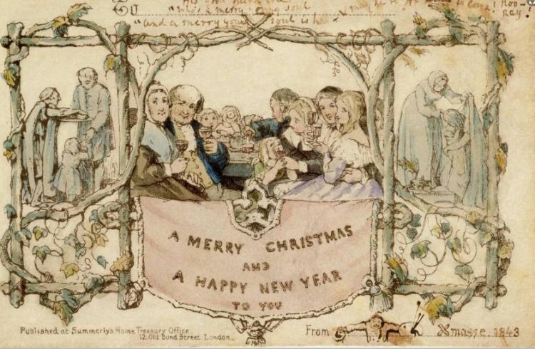
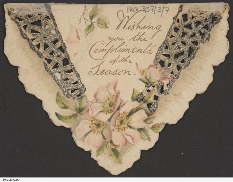
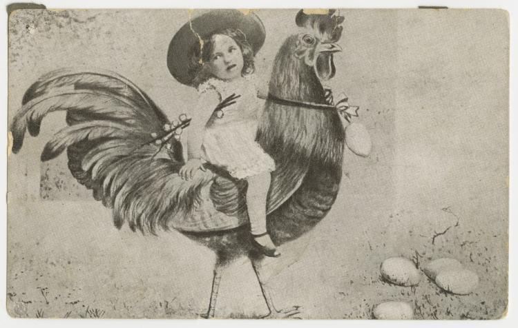
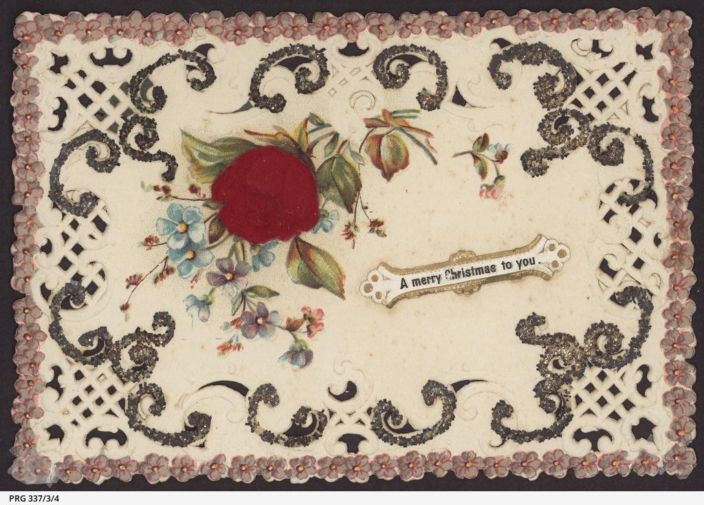
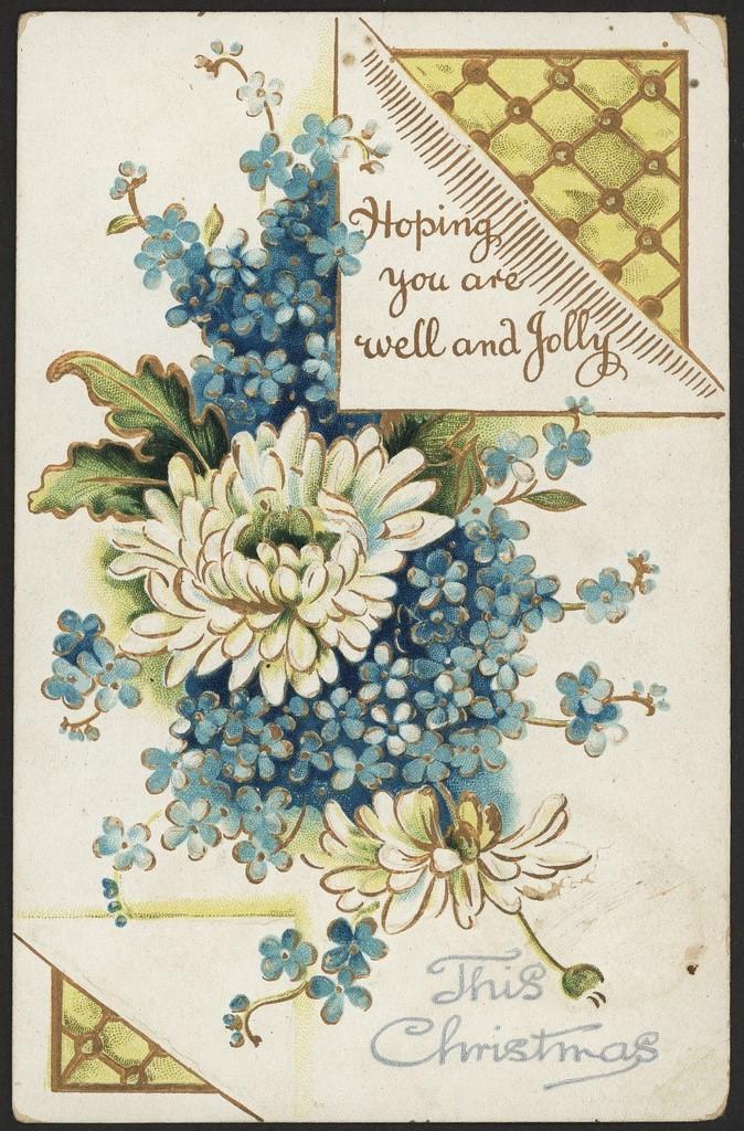
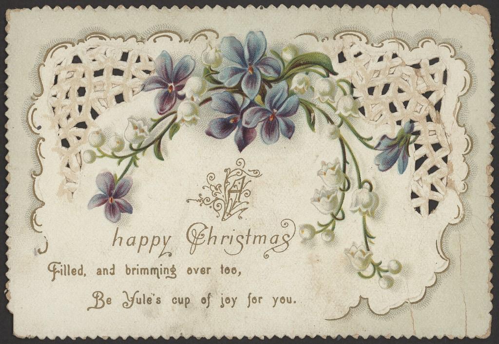
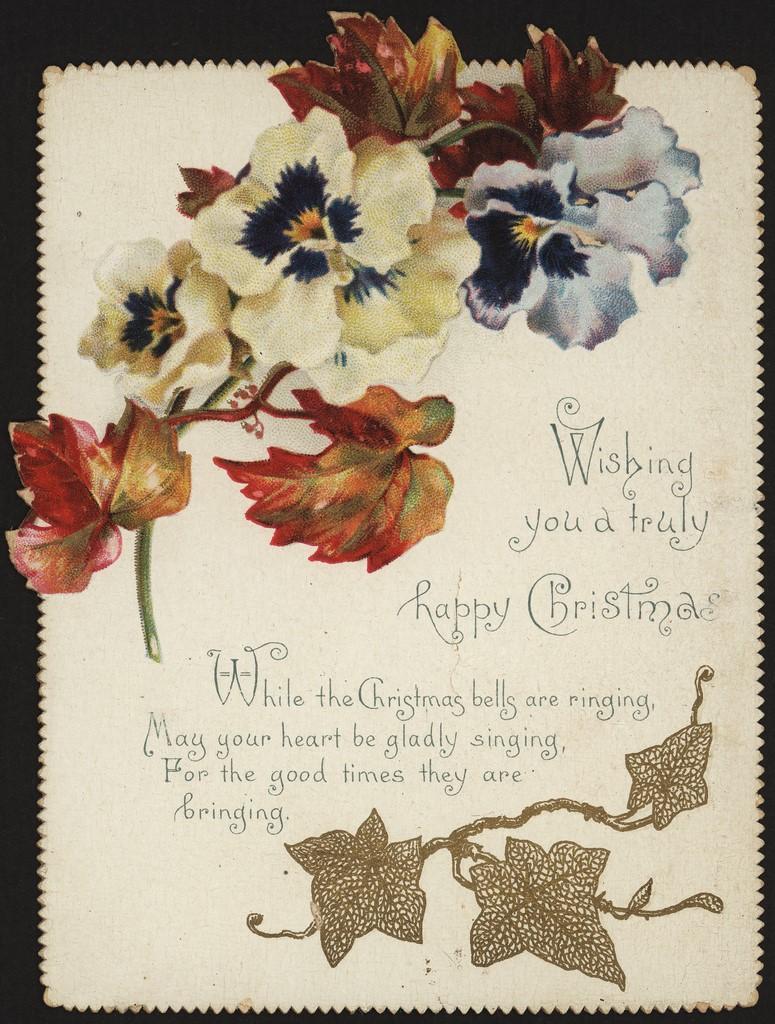
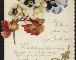
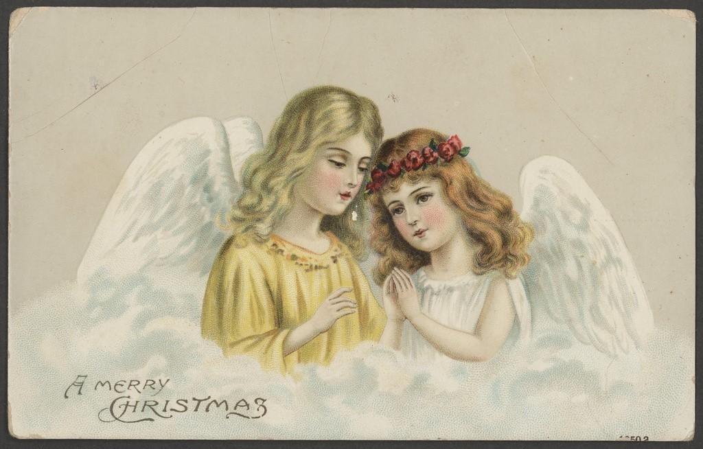
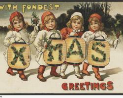
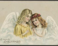
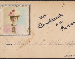
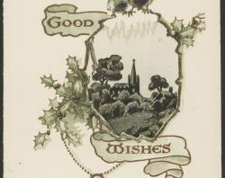
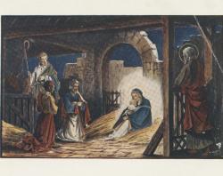
Over the decades various styles of design emerged. There were fashions such as novelty and art cards. In the Victorian and Edwardian eras, some of these pushed the boundaries in their depiction of young women in ‘artistic’ poses. Some cards offered layers of paper that could be lifted to reveal more. Their popularity seems to have faded as the public at large came to realise how much of the model was on display. This might explain the use of the word ‘chaste’ in the following advertisement for Christmas cards and other stationery placed by ES Wigg & Son in the Adelaide Observer on 4 January 1896.
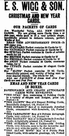
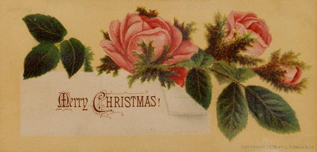
European printers, especially in Germany, took over the card market for a time. English and American printers, including the famous Louis Prang, could not compete with lower production costs. In America sales of cards also declined due to a new fashion of sending gewgaws and gimcracks (cheap items such as jewellry and statuettes) in the 1890s.
However the commercial greeting card industry in Britain and the USA survived and expanded. Eventually Christmas cards with matching envelopes made a comeback and overtook the postcard. The USA greeting card business revived in 1915 when Joyce Clyde Hall and his brother Rollie, after a fire which destroyed their earlier business venture, decided to increase production. They installed printing presses to produce greater volume under the name Hallmark which became a global company. By the early twentieth century, professional card designers were being employed by larger producers. Competitions were held to find the most beautiful greeting card. In the interwar years and by the 1950s high profile artists like Norman Rockwell and Salvador Dali were being regularly engaged to create prestigious lines.
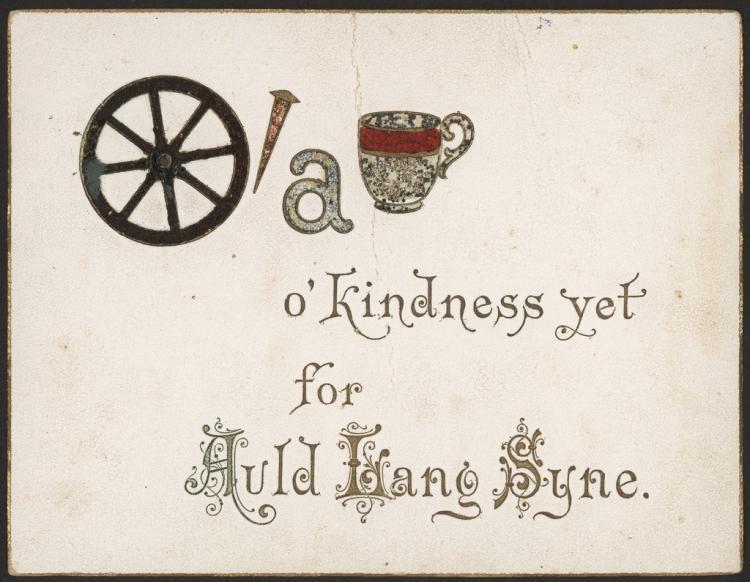
Throughout the nineteenth century, styles and fashions changed but some symbols recurred and remain popular even in the 21st century. Humorous and quirky cards were popular as were puzzle cards such as the Scottish New Year's card below.
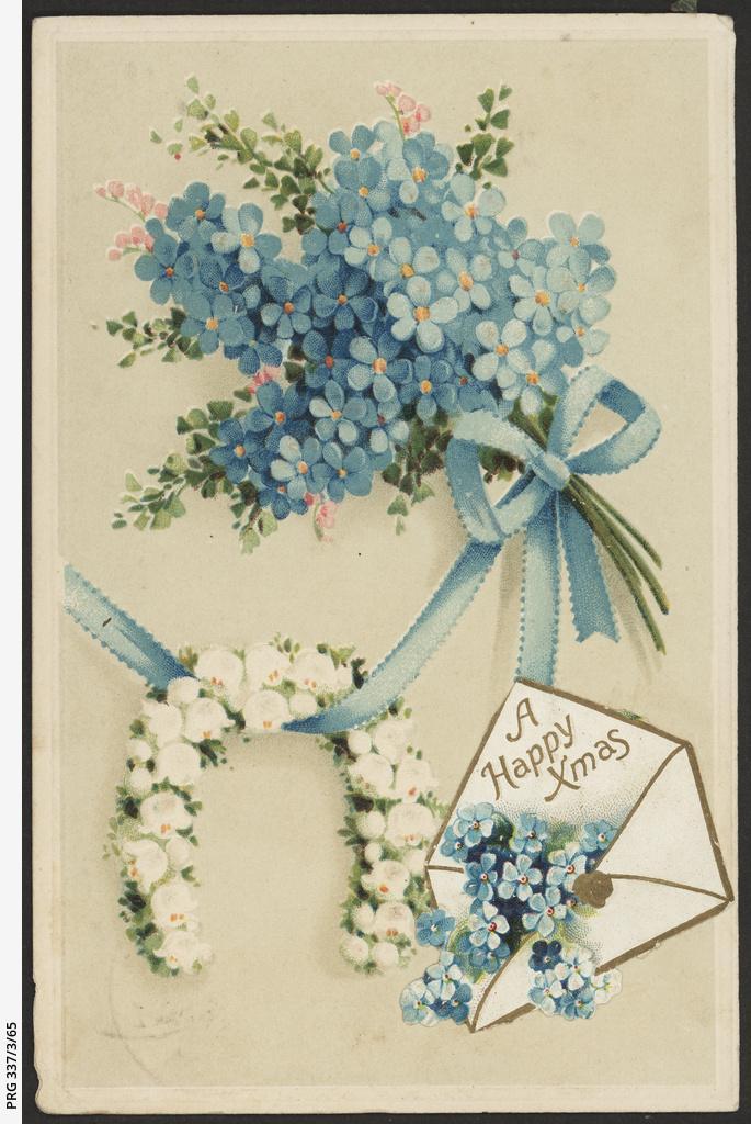
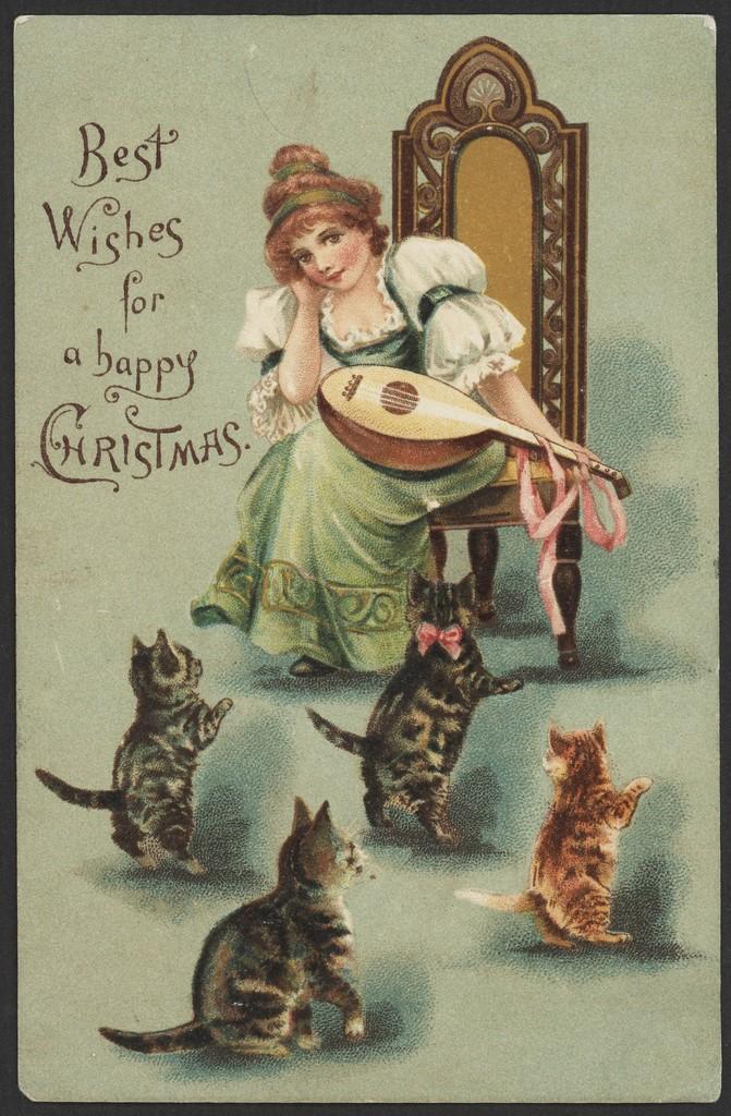
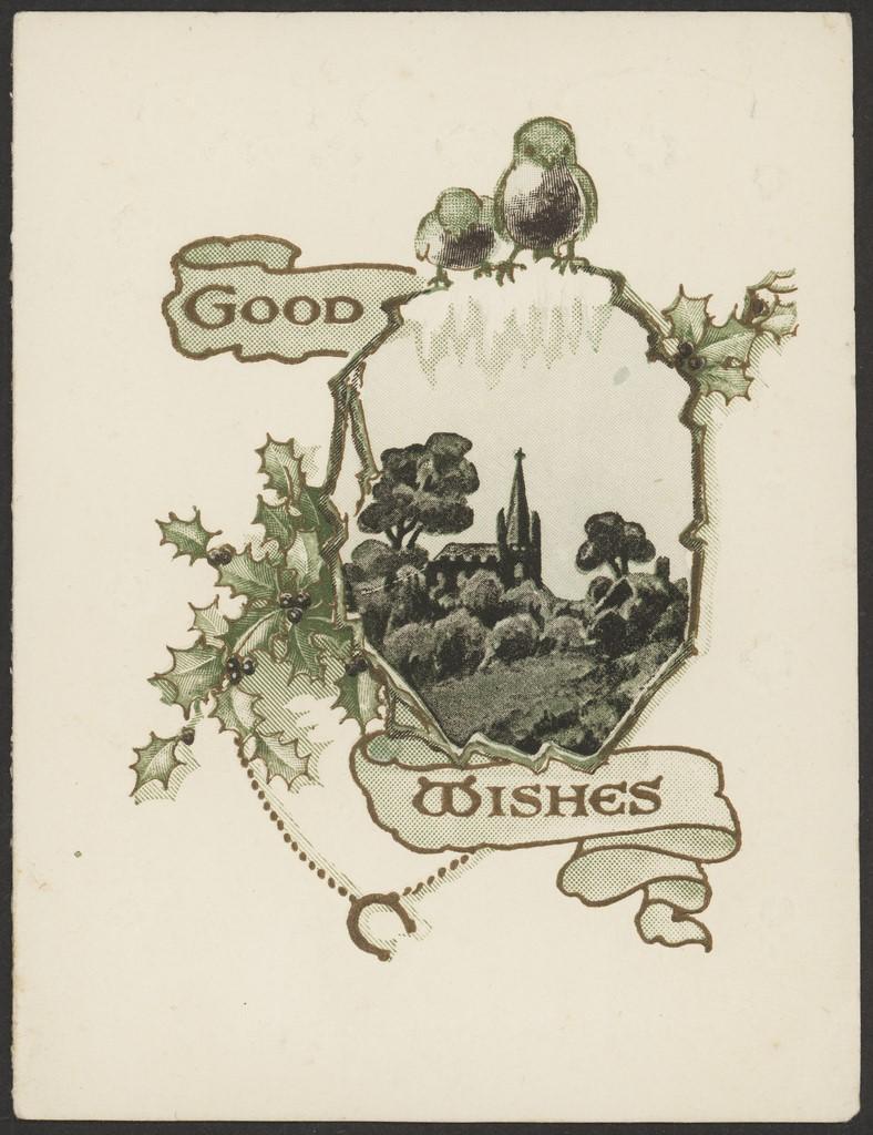
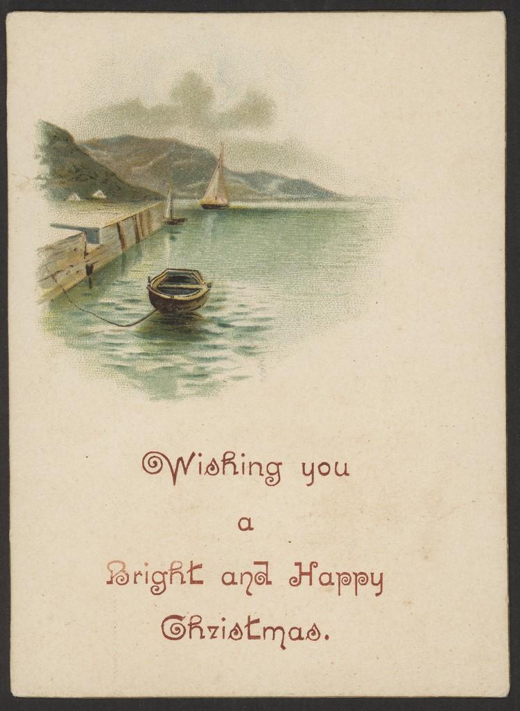
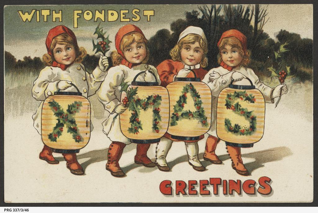
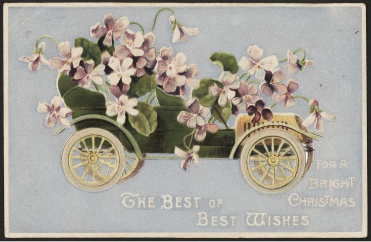
Cars and boats, a symbol of affluence for the growing middle classes, were a recurring feature. Snow-covered landscapes reflecting the northern hemisphere remained a firm favourite in Australia. Holly, ivy, bells, robins, doves and other birds featured strongly, as did fairies, elves, reindeer, cats, piglets, mice and frogs, often dancing or playing instruments. Children in snowy landscapes were a frequent feature. The word Xmas often replaced the traditional spelling of Christmas. The 'Xmas' form goes back to ancient times and is not, as many believe, a recent invention.
The poster boy of Christmas
And of course Christmas would not be Christmas without a visit from Father Christmas, aka Santa Claus, that jolly, generous red-suited gent with his sack of presents.
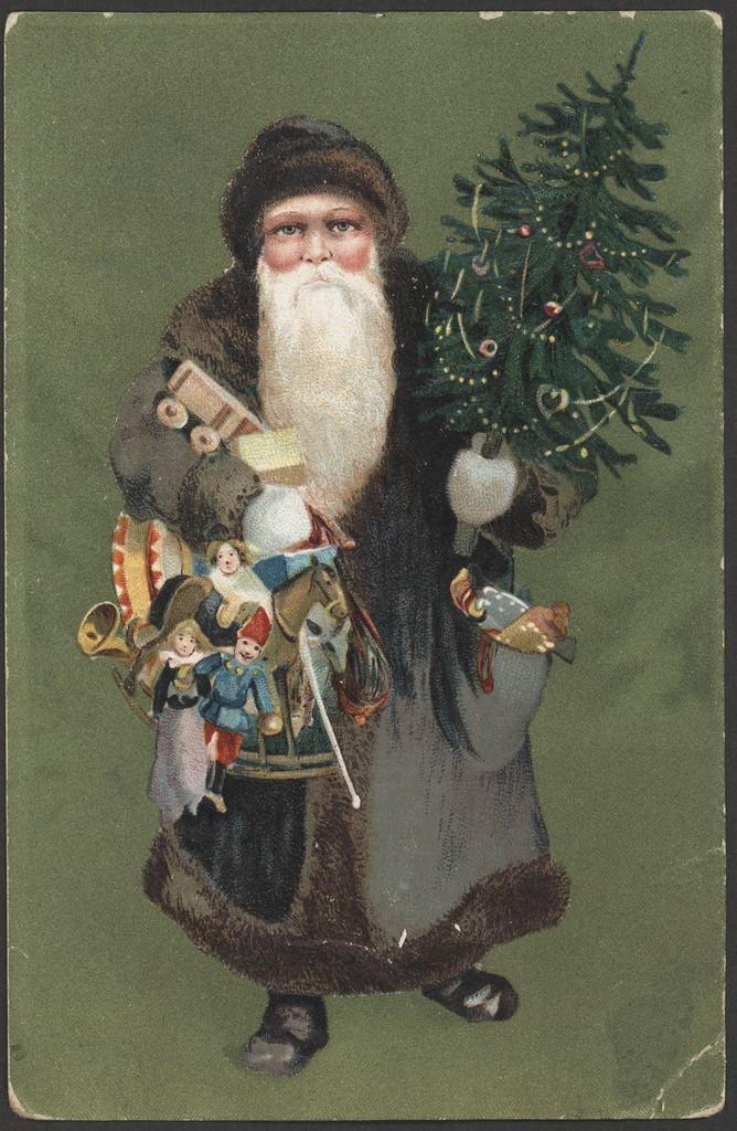
Verses were often an integral part of the cover design. Biblical texts were sometimes invoked but generally messages were secular. Humorous poems also provided inspiration. ‘A Visit from St. Nicholas’ was one of these. This influential poem was originally claimed to be the work of Clement Clarke Moore but the author is now generally accepted to be Major Henry Livingston, Jr. Often known just by its first few words: 'Twas the night before Christmas’, the work did a lot to popularise the appearance of St Nicholas as a plump jolly man with rosy cheeks, twinkling eyes and a white beard. St Nicholas was a Syrian Bishop (perhaps apocryphal) renowned for his generosity, especially at Christmas. He was the precursor to Santa Claus or Father Christmas. However early depictions of St Nicholas on Christmas cards usually show him in brown, tan or grey, not red, and usually less rotund than Father Christmas.
Current ideas of Father Christmas go back to 1863 when cartoonist Thomas Nast drew him him for Harper’s Weekly. Nast and subsequent illustrators based Santa on the poem. 'Decades later, in the 1930s, an illustrator named Haddon Sundblum (Sunbloom) designed a series of advertisements for Coca Cola. Their global advertising campaign spread the image of Santa Claus or Father Christmas as a chubby old gent in a red suit and cap trimmed with white fur. This is how we see Father Christmas today.
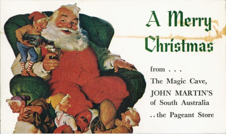
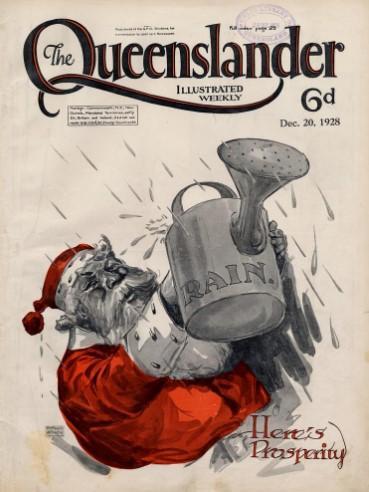
Contrary to popular belief, Coca Cola did not turn Santa’s suit red although they did popularise it. The company adopted the red-suited figure because the colours matched their advertising plans. Santa had already worn red in numerous nineteenth century advertisements for soap, cigars and confectionary such as Sugar Plums, a sweet produced by the US Confection Company. He also graced the covers of a number of magazines, including the December 1896 cover of Puck Magazine, and interestingly, several December covers of The Queenslander magazine.
Despite technology, the giving or sending of physical cards remains an annual tradition, though on a smaller scale than in the past. Perhaps this is due to the personal effort involved in selection and writing. Seeking out the right card for the right person can be a creative act and receiving it can bring genuine pleasure.
Wishing you a merry Christmas
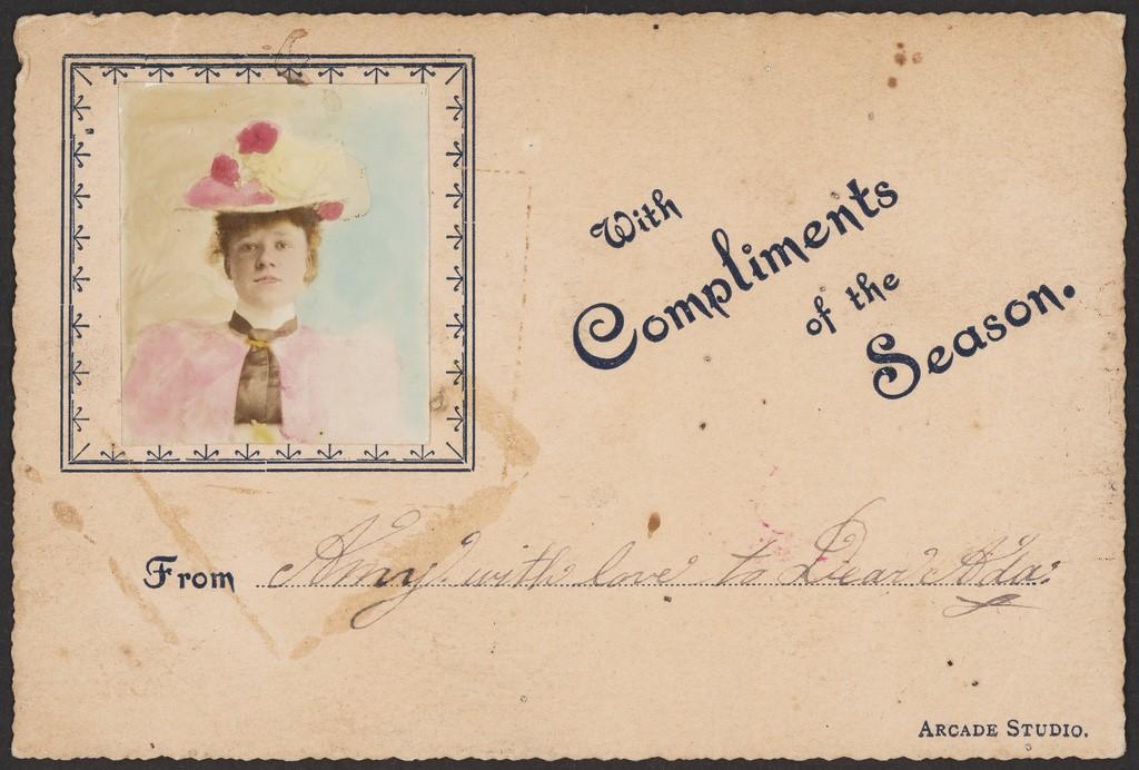
For decades, many Christmas and New Year’s cards were treasured mementoes. They were pasted into albums and kept as reminders of friendship and goodwill.
They took their place alongside birthday cards, Valentines, Bon Voyage, congratulations on the birth of a child or a school graduation, or condolences on the passing of a family member or close friend. Greeting cards were, and remain, small reminders of a lifetime and the people who have filled it.
Written by Isabel Story, Engagement Librarian
