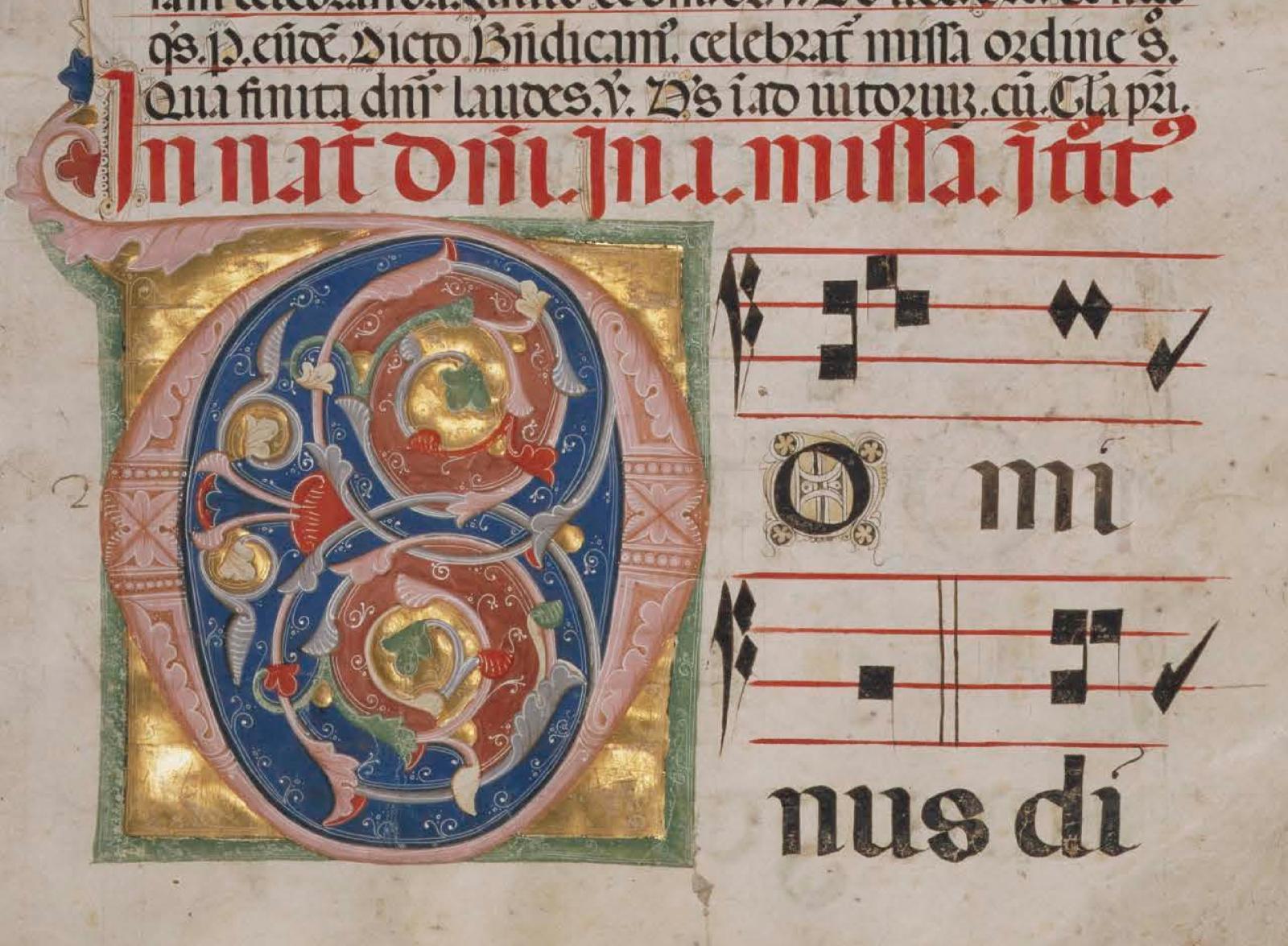
Shall I Pen You a Letter: Initials in Manuscript and Print
"No pattern should be without some sort of meaning." ~ William Morris
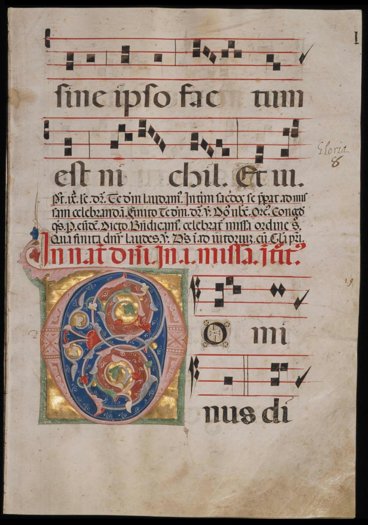
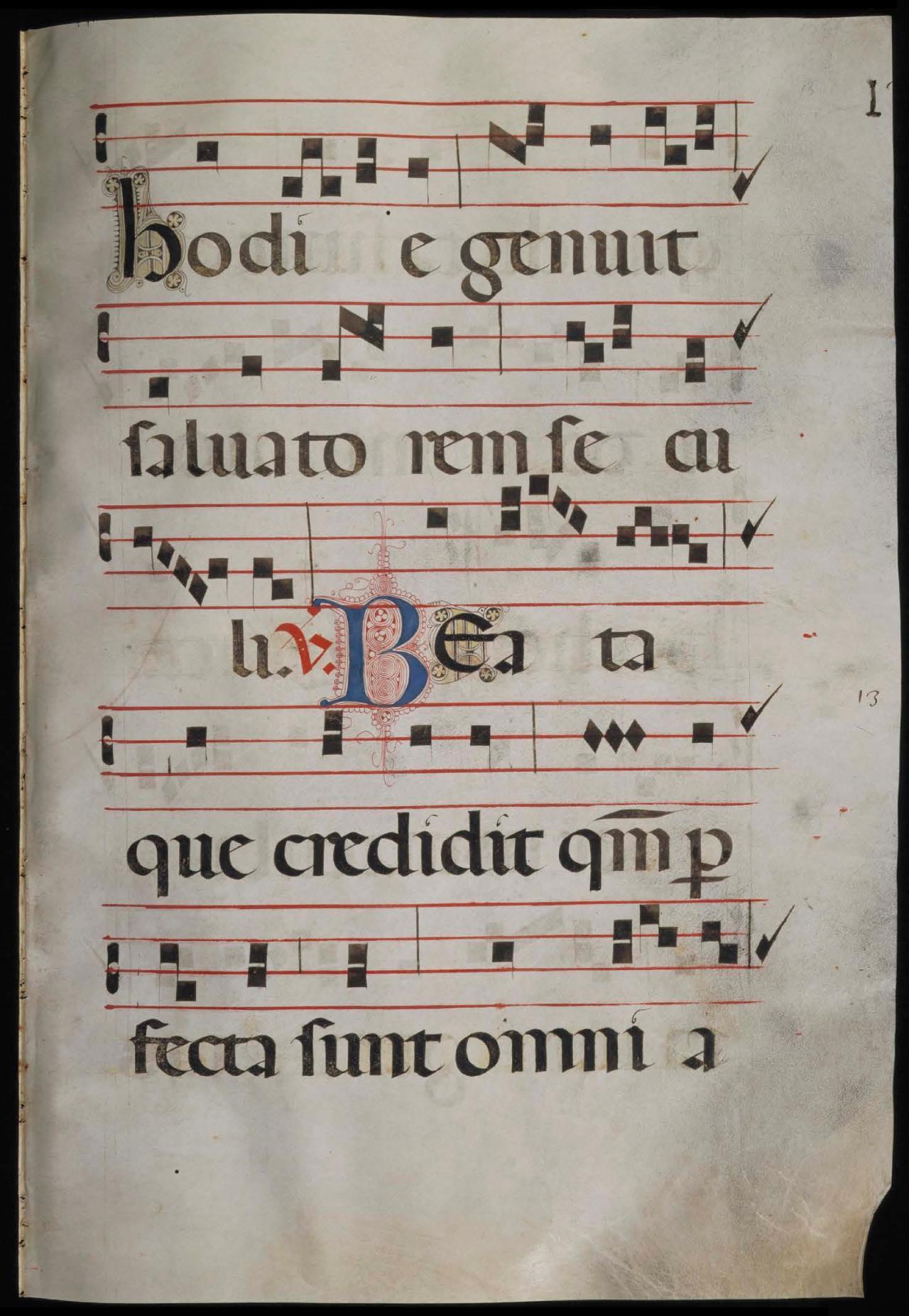
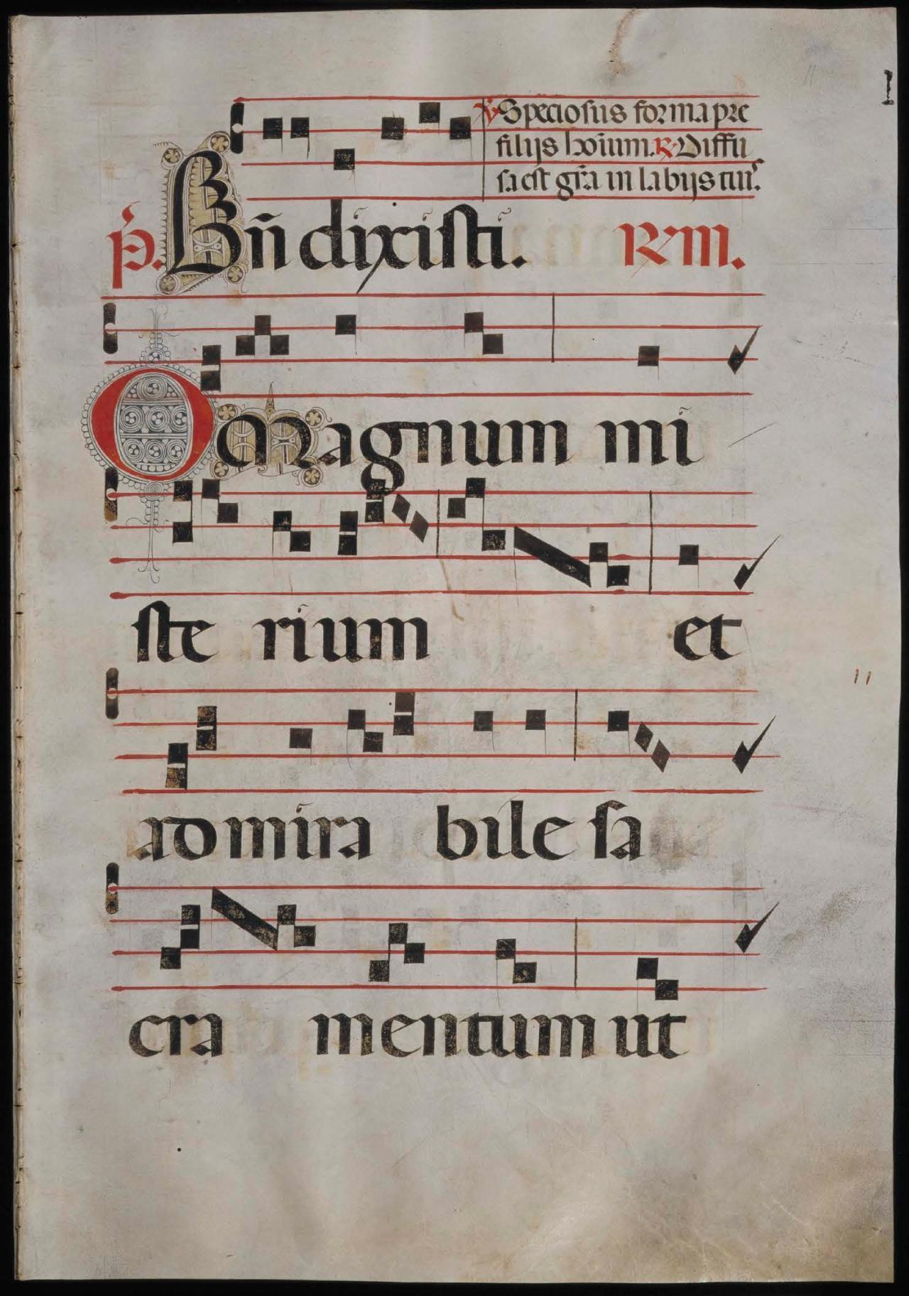
Inhabited and Figurative Letters
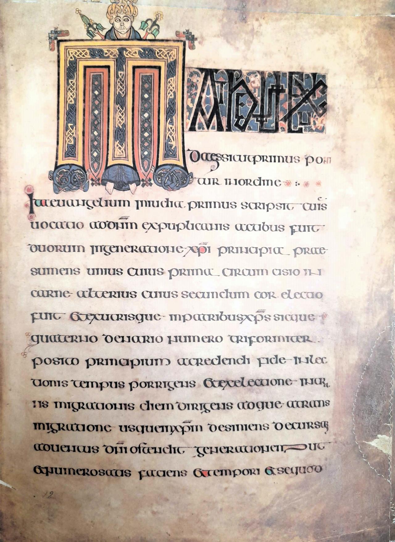
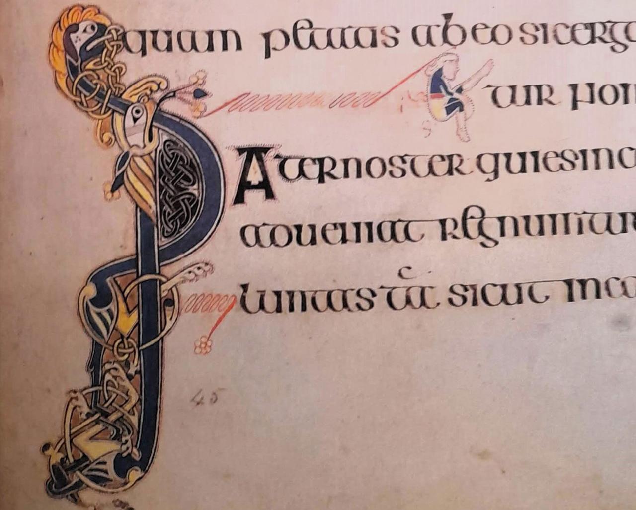
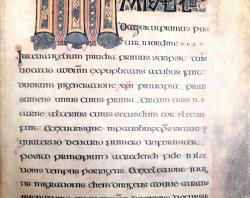
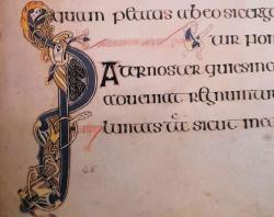
Inhabited letters contain animals, people, or fantastical creatures within the letter, while figurative letters are made up of contorted creatures in the form of letters.
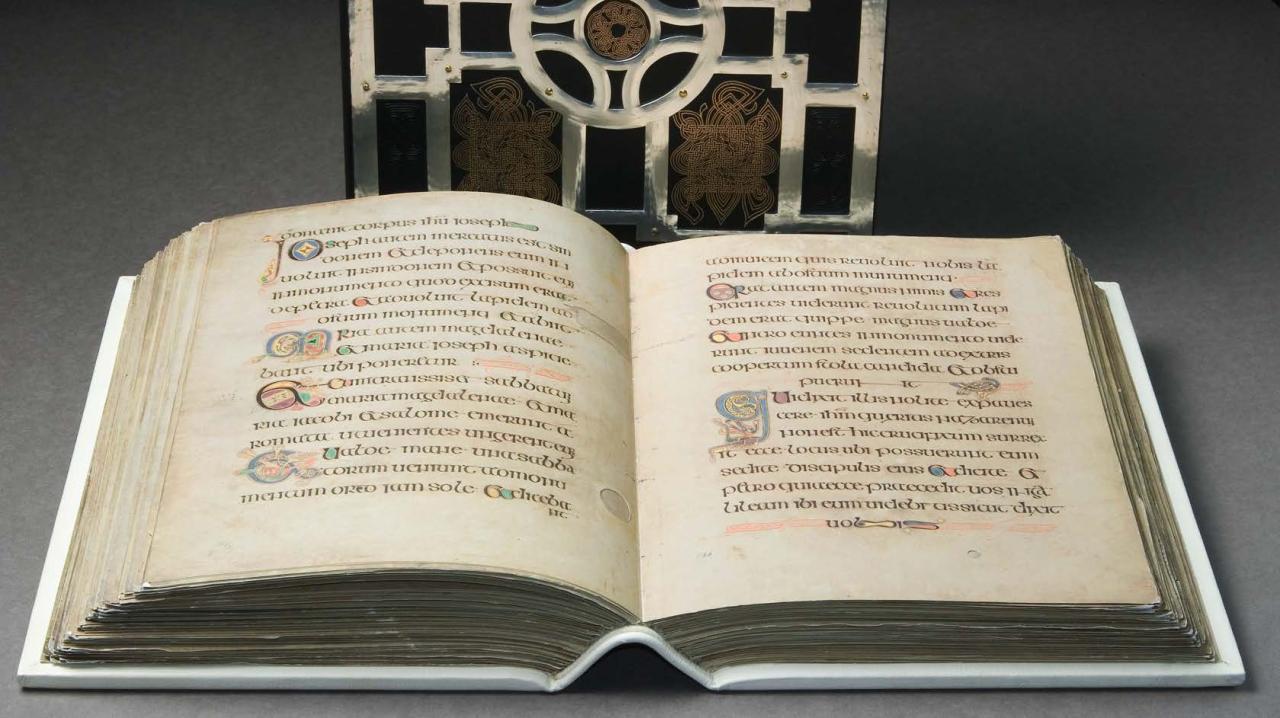
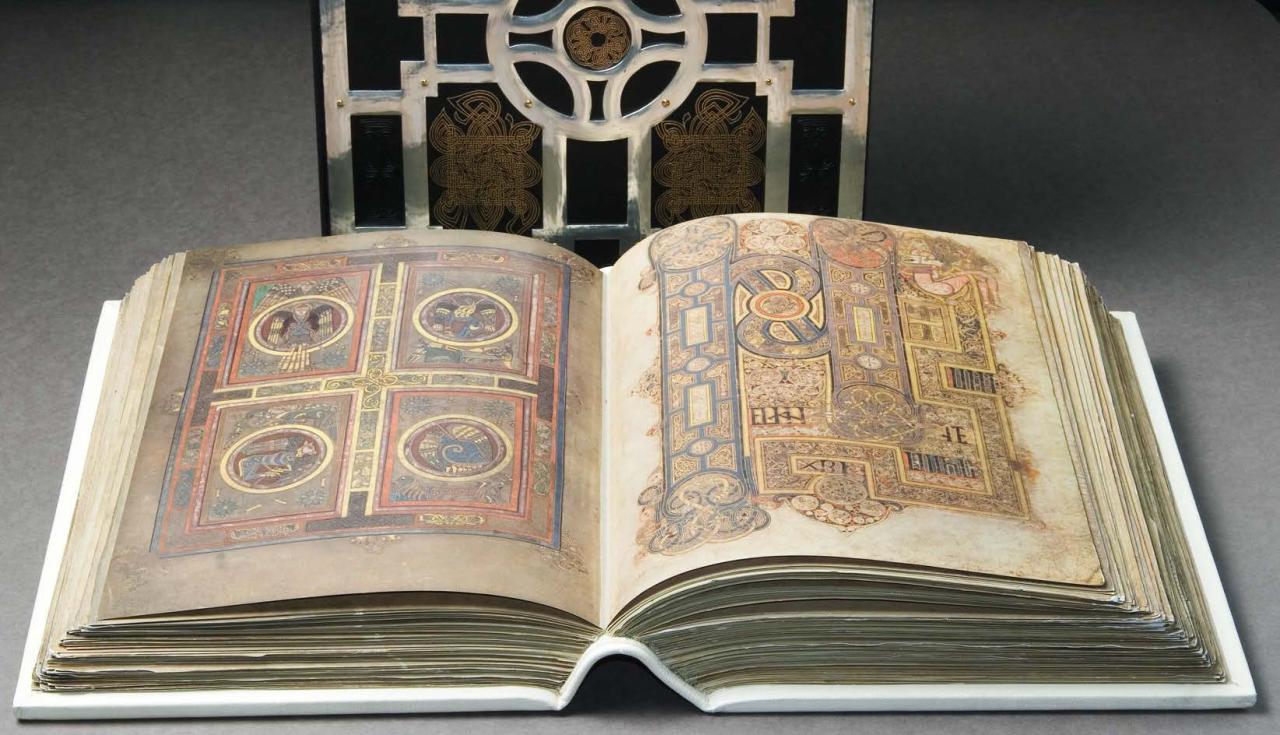
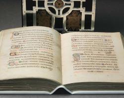
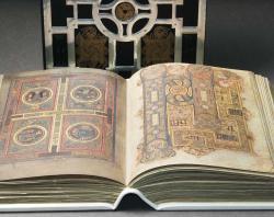
Examples of both can be found in the Book of Kells (circa. 800AD). The State Library holds the 1990 facsimile edition of the book produced by Fine Art Facsimile Publishers of Switzerland, the first time the Book of Kells was reproduced in colour. It is a nearly identical copy of the original, right down to the holes chewed by bookworms and the signs of water damage to the pages. Each Gospel starts with a major initial, with the letters containing angels, human figures, and beasts. You can learn more about the Book of Kells from our digital copy.
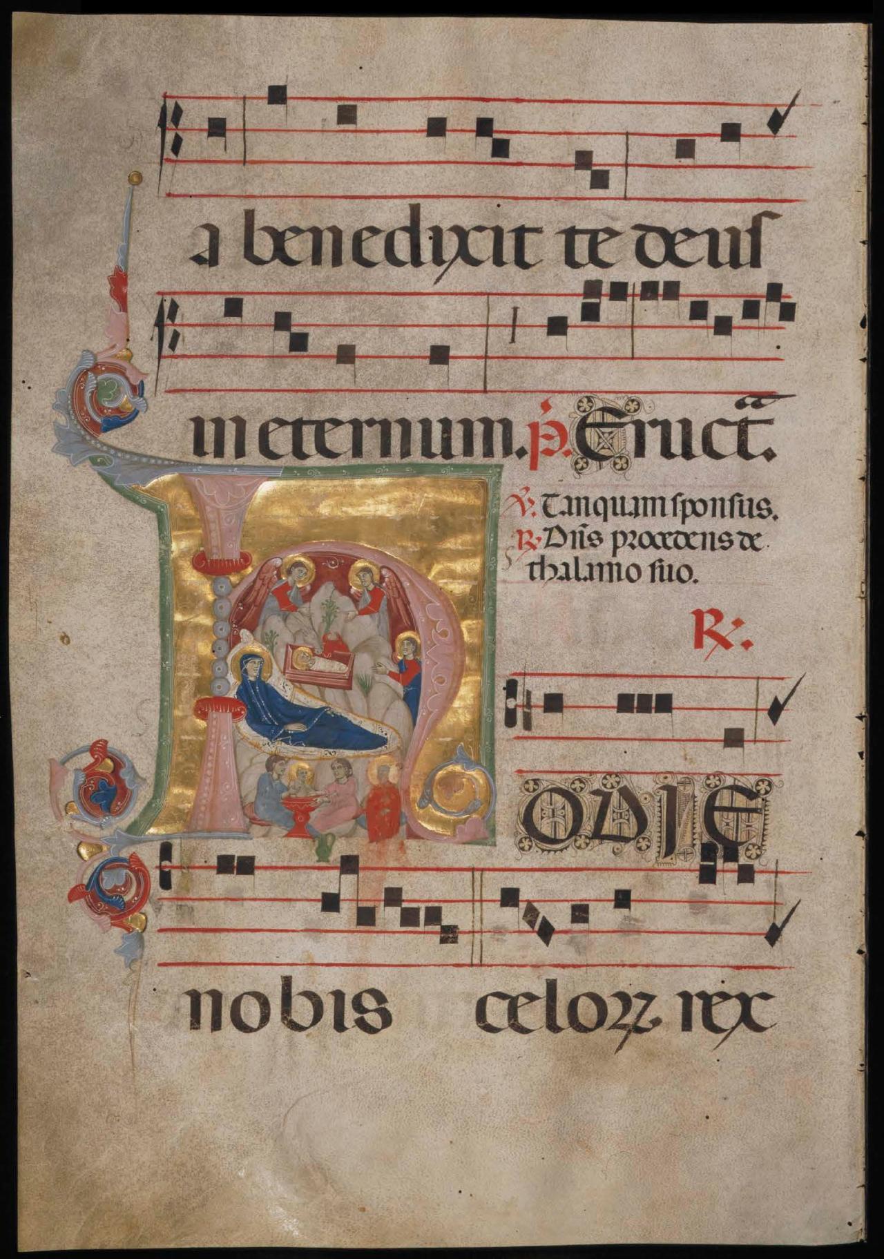
Historiated Letters
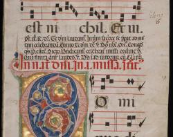
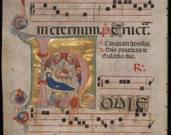
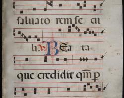
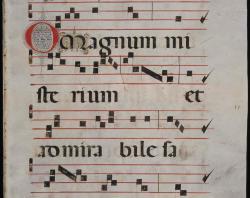
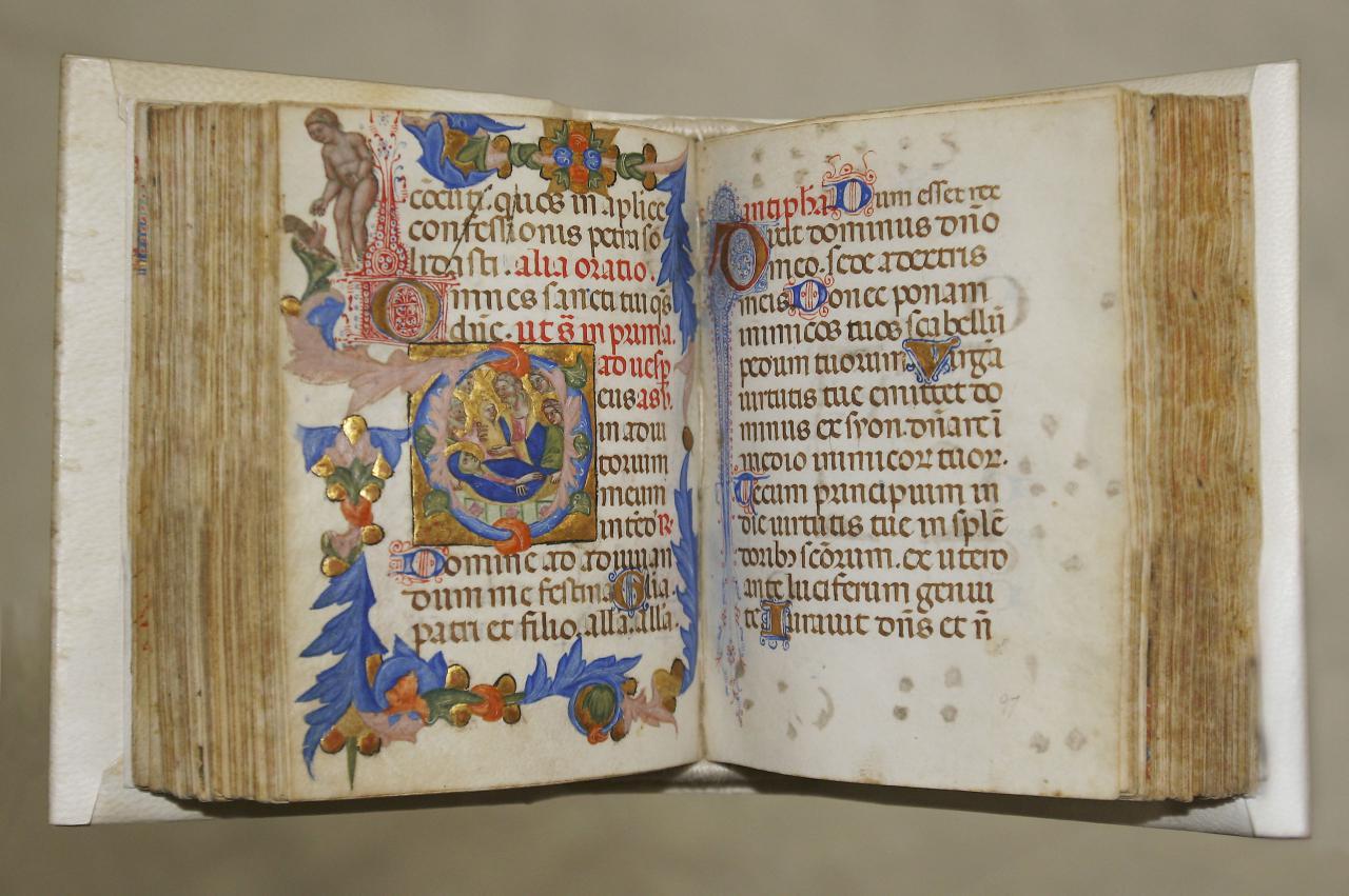
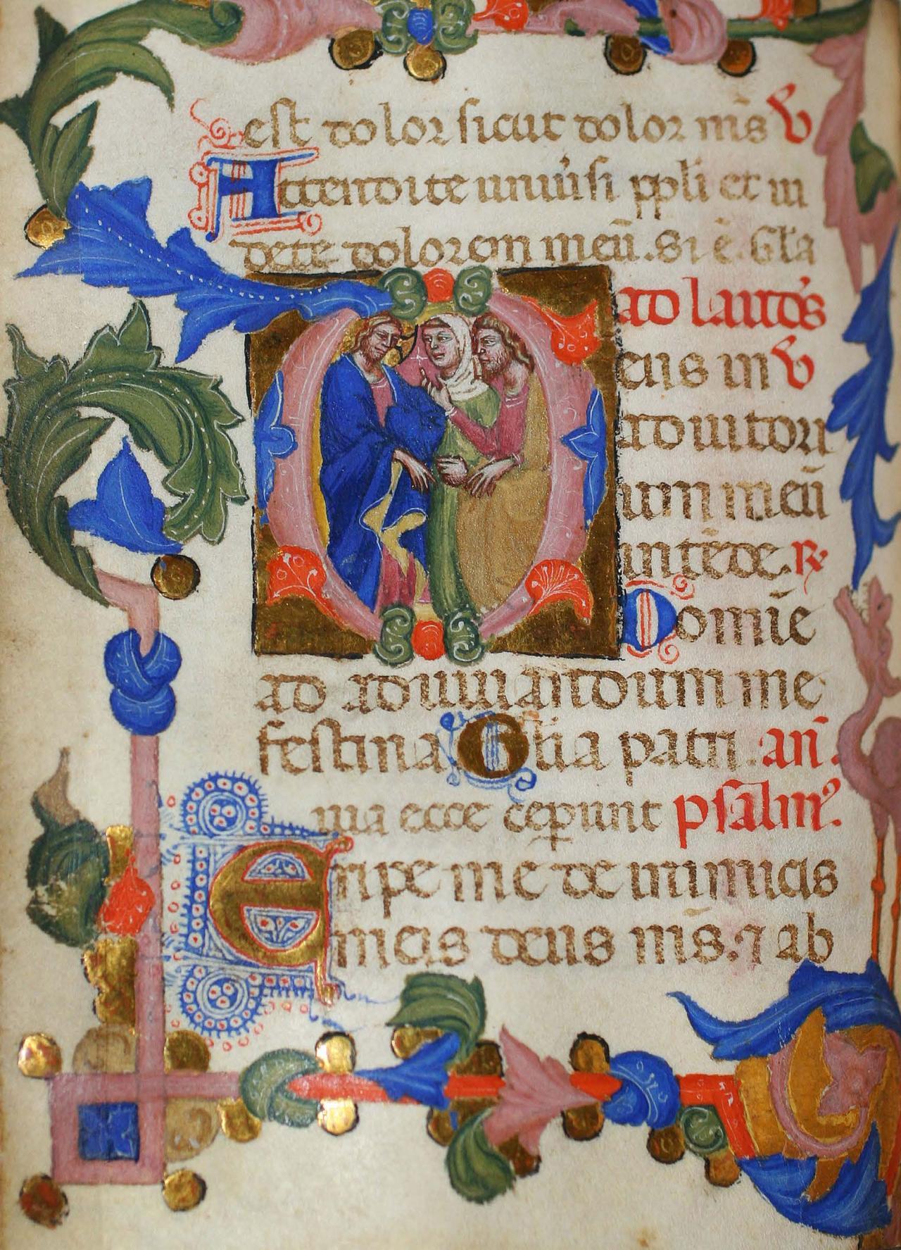
Like inhabited letters, historiated letters contain illustrations of humans or animals housed within the letter, except that historiated letters contain scenes directly related to the accompanying text. Historiated letters are commonly seen in early religious texts, such as Bibles and Books of Hours. This Italian book of hours, dated ca. 1375 is richly decorated, featuring Gothic text, detailed borders, and 19 thumbnail sized historiated initials. The hand-painted initials are decorated with gold. When coupled with the rich colours used for both illustrations and text, they further add to the beauty of the work. Learn more about this work here.
Initials in Published Works Post-1450
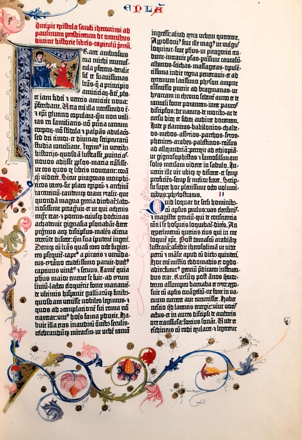
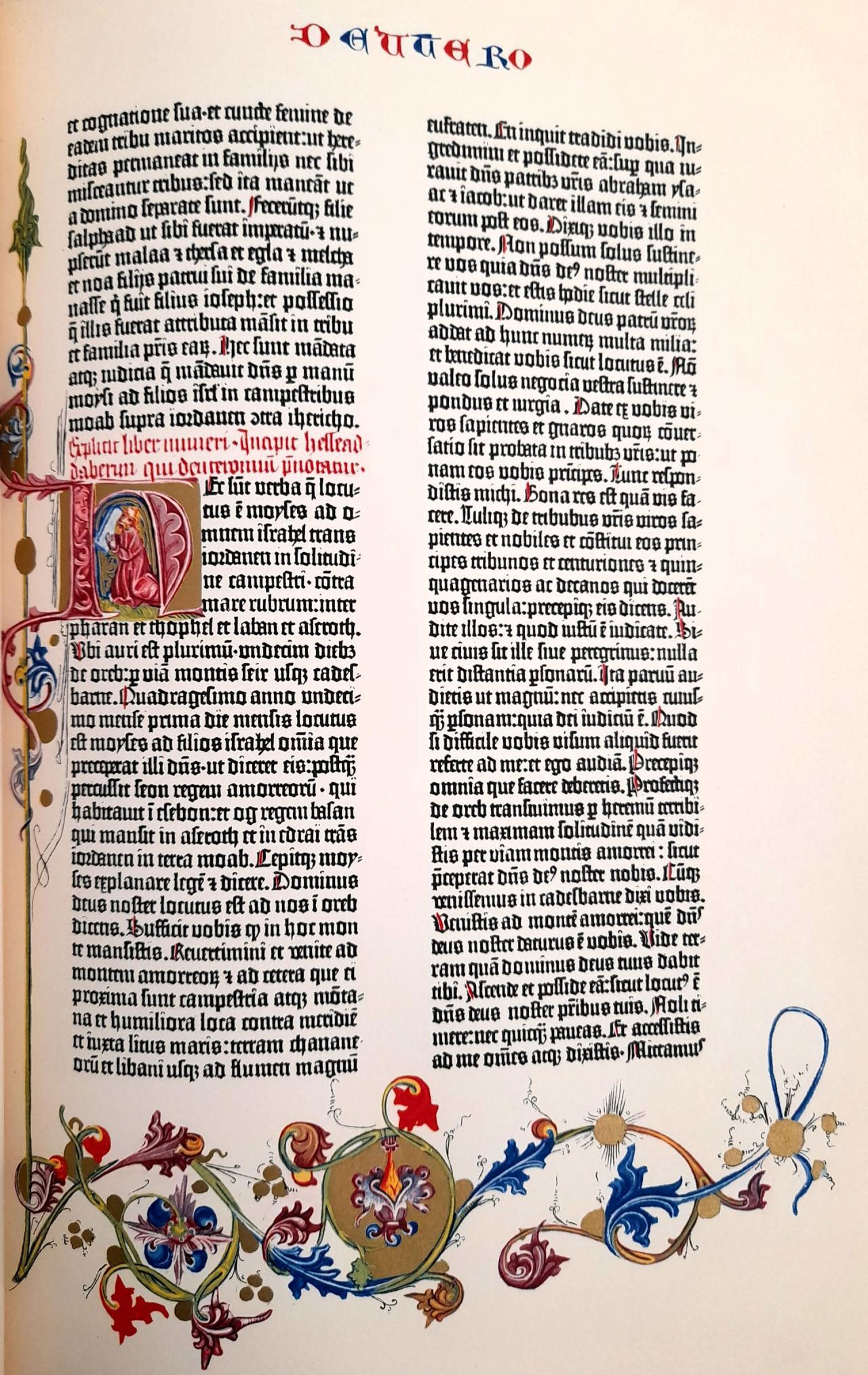
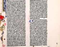
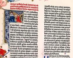
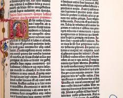
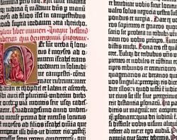
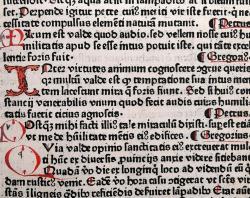
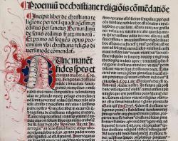
By the mid-15th century, the Western world saw the introduction of moveable type printing, starting with Johannes Gutenberg’s press located in Mainz, Germany. By 1455, Johannes would produce the first printed work in Europe - the monumental Biblia Latina, known commonly as the ‘Gutenberg Bible.’
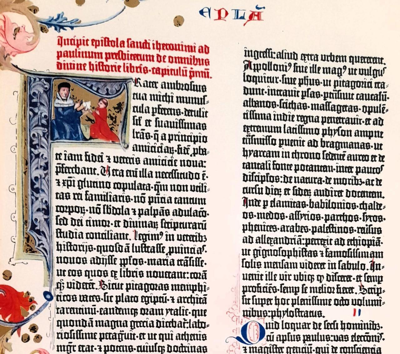
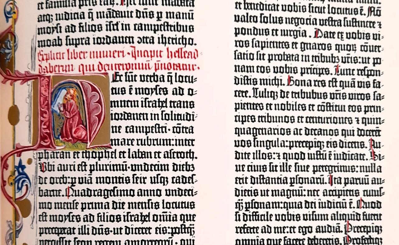
The text was printed using a typeface designed by Gutenberg to emulate the hand-written Gothic script used in many religious texts at the time. The book was complemented throughout with hand-drawn illustrations including initials and elaborate marginalia. Pictured below are two examples of initials from our facsimile reproduction of the Gutenberg Bible which was published by Pageant Books in 1961 and is based on the original volumes held at both the Koniglichen Bibliothek in Berlin and the Standischen Landesbibliothek in Fulda.
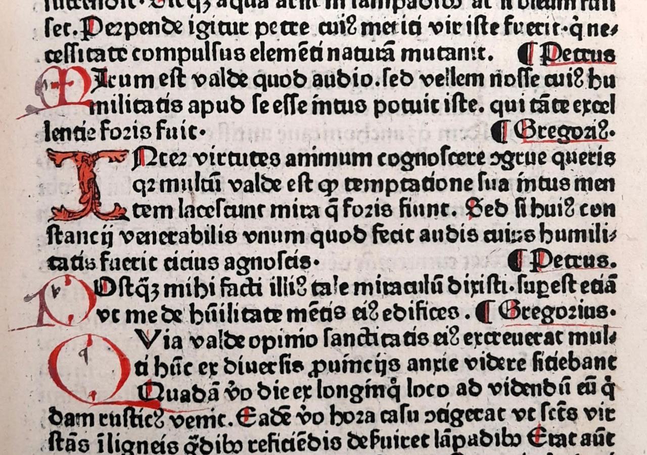
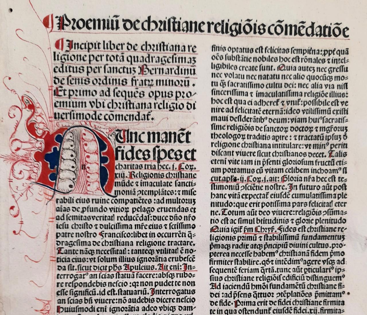
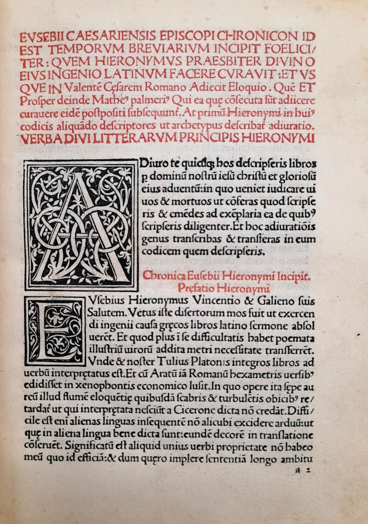
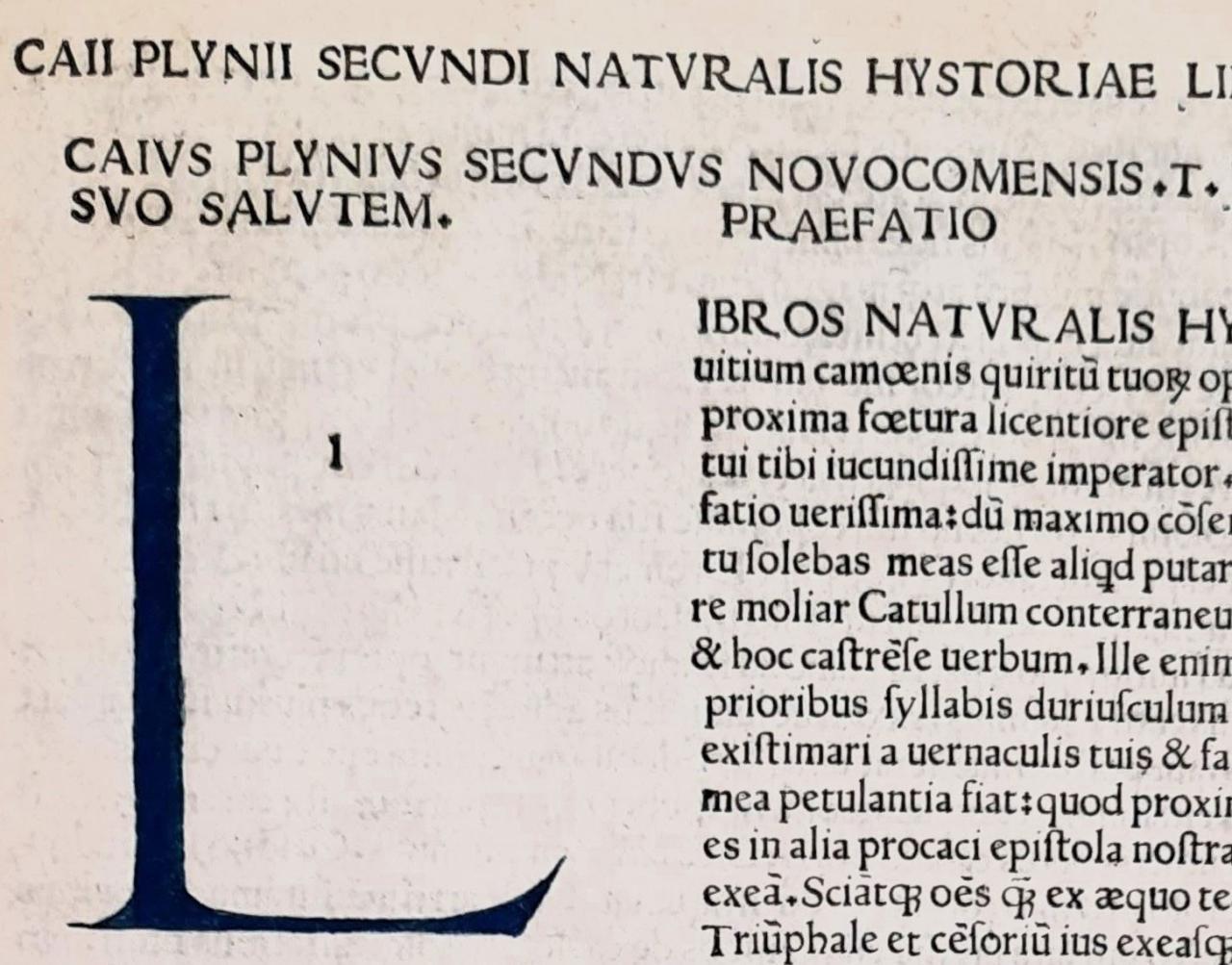
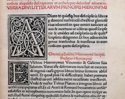
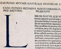
Printing was initially limited to only one or two colours. For two colours, usually black and red, the process required each page to be printed on twice. This would involve setting and printing the black type first, with blank spaces left for the second colour, then the new type would be set and printed with the second colour. As this was an expensive and time-consuming process it quickly disappeared from hand-printed works. Any woodcut and engraved initials, illustrations and other decorative elements would also be added during the printing process – depending on the type of element, this would either be done at the same time as the rest of the typesetting or as a separate process.
Printers would rarely decorate or bind the works, selling them unbound and wrapped in a protective paper layer. This would leave the purchaser to have the book decorated and bound to suit their tastes, commissioning illuminators, colourists, and bookbinders to complete them. Decorative elements added by these artists could include: rubrication, where red lettering and details are added to books by hand; hand-drawn initials; colouring of illustrations and printed initials; and leather bindings often decorated with gilt (a process of embossing leather with gold). These practices would start to see a decline from the mid-18th century onwards.
Books as Art (the Private Press Movement)
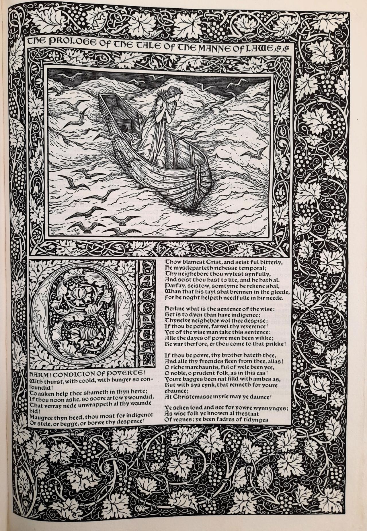
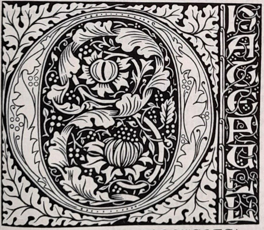
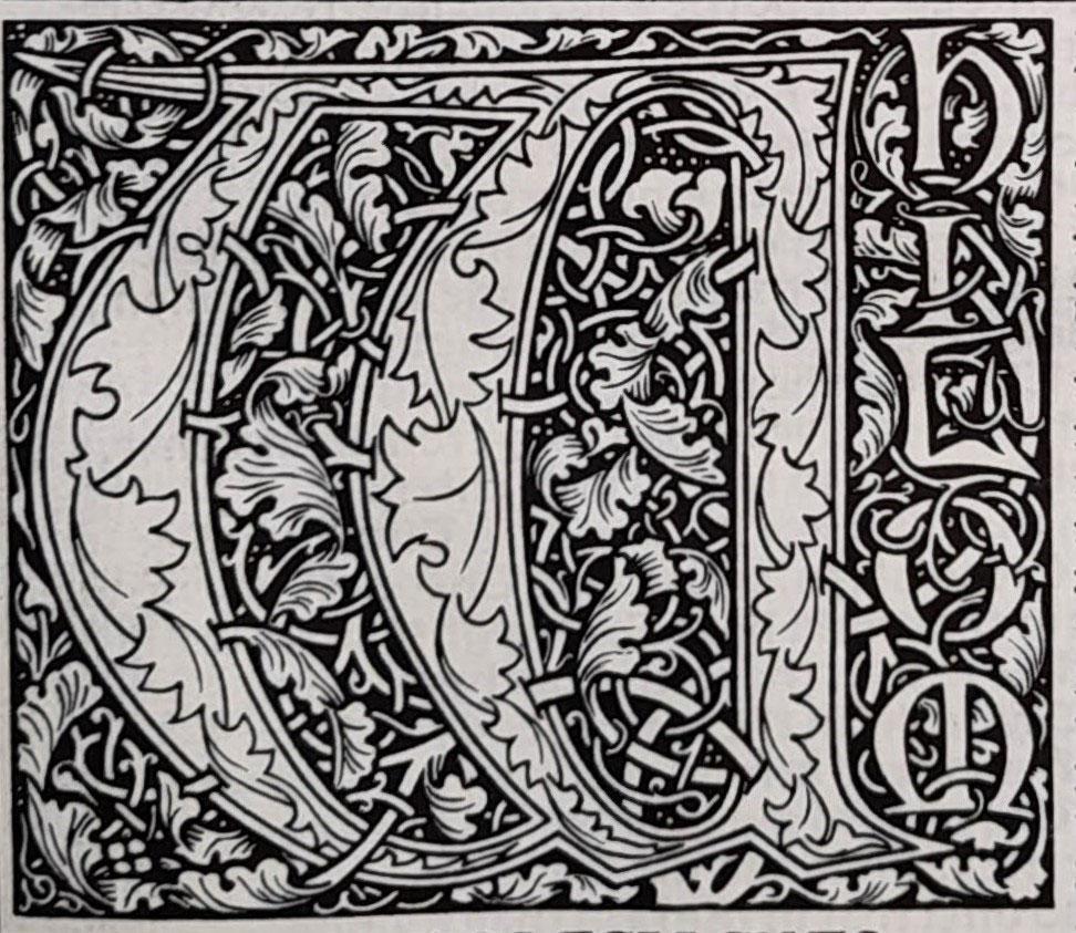
The late nineteenth century saw the rise of the English Arts and Crafts Movement, and the development of private presses. Both encouraged the “celebration of craftmanship” during the rise of the industrial age. Private presses began to produce limited run books which combined custom-designed typefaces and decorations, commissioned artwork, and beautiful bindings, to create books that were also visually cohesive and beautiful objects. Books produced by William Morris’ Kelmscott Press and the Golden Cockerel Press serve as wonderful examples of this vision.
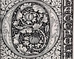
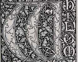
In the examples below we see some initials from the Kelmscott Press’ monumental work, The works of Geoffrey Chaucer (1896). The designer, craftsman, poet, and socialist William Morris believed that the world should be beautiful and designed all manner of objects including wallpaper, furniture, and books to fulfil his vision. The Kelmscott Chaucer was his final masterpiece and has often been referred to as one of the most beautiful books in existence. The book took four years to produce and featured 87 woodcuts by the painter Edward Burne-Jones, a long-time friend of Morris. Only 438 books were produced, 425 copies on handmade paper, and another 13 printed on vellum.
The State Library is fortunate to hold an original of the Kelmscott Chaucer, and a copy of the 1975 Basilisk Press facsimile.
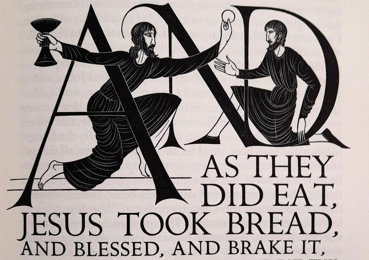
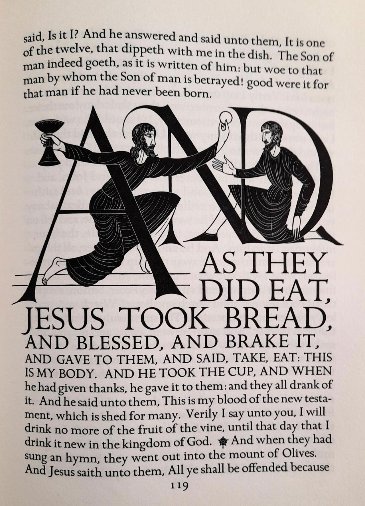
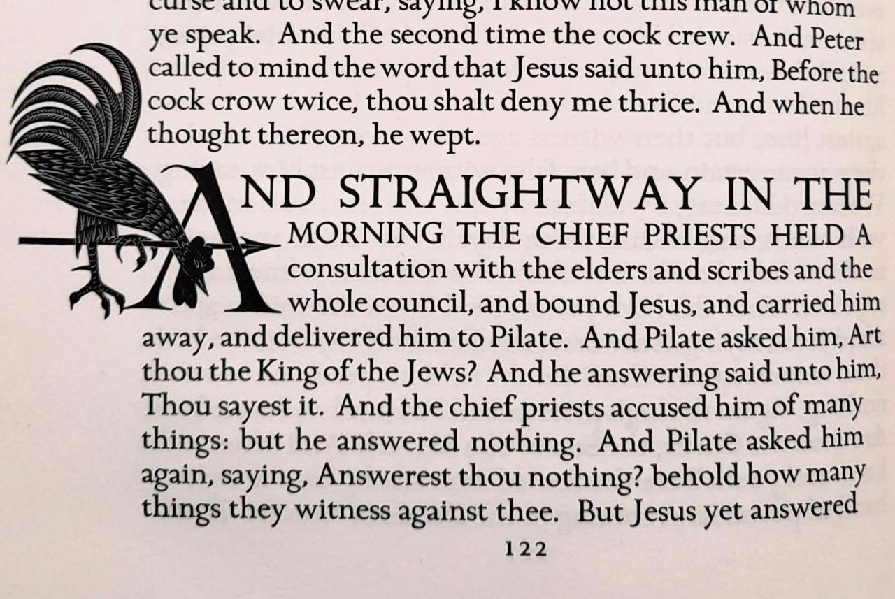
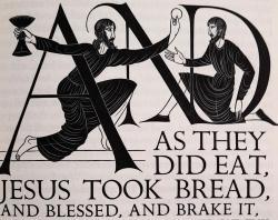
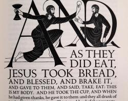
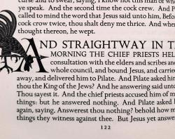
Our last example is another private press production, The four Gospels of the Lord Jesus Christ according to the Authorized version of King James I. With decorations by Eric Gill. Eric Gill was a printmaker, type designer, and stone carver, who wanted to combine craftsmanship with the sense of purpose he found in religious communities. He was influenced by the English Arts and Crafts Movement and William Morris. The Four Gospels of the Lord Jesus Christ is minimalist and modern in appearance however, in stark contrast to Morris’ more elaborate productions. The Gospels, printed by the Golden Cockerel Press in 1931, features handset type, handmade paper, and woodcut engravings. The woodcuts are used in a similar manner as historiated initials, with the illustrations relating directly to the text.
Modern works have mostly left behind the art of the initial. As books became more commonplace and accessible, such elaborate methods of drawing attention to sections or to provide aids to memory while reading seemed no longer necessary.
And so, we reach the end of our exploration of some of the initials that can be found in the State Library collections. You can see more of our digitised illuminated works by searching “illumination” in the State Library Digital Collections or catalogue.
Written by Marie Larsen, Collection Maintenance Officer - Library Technician
More to explore
William Morris, May Morris (2012). “The Collected Works of William Morris: With Introductions by His Daughter May Morris”, p.111, Cambridge University Press
The Decorated Letter (2008) The Decorated Letter (Getty Center exhibitions). Available at: https://www.getty.edu/art/exhibitions/decorated_letter/ (Accessed: 19 April 2024).
Initials: In the beginning... (2011) Initials: In the Beginning..., University of Otago, New Zealand. Available at: https://www.otago.ac.nz/library/exhibitions/initials/index.html (Accessed: 19 April 2024).
The Kelmscott Chaucer (no date) Thomas Fisher Rare Book Library. Available at: https://fisher.library.utoronto.ca/collections/kelmscott-chaucer (Accessed: 19 April 2024).
Eric Gill and the Golden Cockerel Press (no date) Research Guides at Library of Congress. Available at: https://guides.loc.gov/medievalism/gill (Accessed: 19 April 2024).
Raven, J. (2020) The Oxford Illustrated History of the Book. Oxford: Oxford University Press.
Pearson, D. (2008) Books as History: The importance of books beyond their texts. London: British Library.
Lyons, M. (2011) Books: A living history. London: Thames and Hudson.
